Virgio · Product Design, 2024
The price tag customers trusted enough to share
Virgio sells quality fashion at honest margins, but a ₹2,100 tag felt as arbitrary as any other. On day one, my manager asked: how do we get customers to trust our prices? I designed a transparency widget that shows where every rupee goes, structured like a bill, not a chart. A customer’s post about it reached 550K+ people, it won a Silver DIGIES for Best E-commerce Design, and became the IP behind Virgio’s Econic Fair.
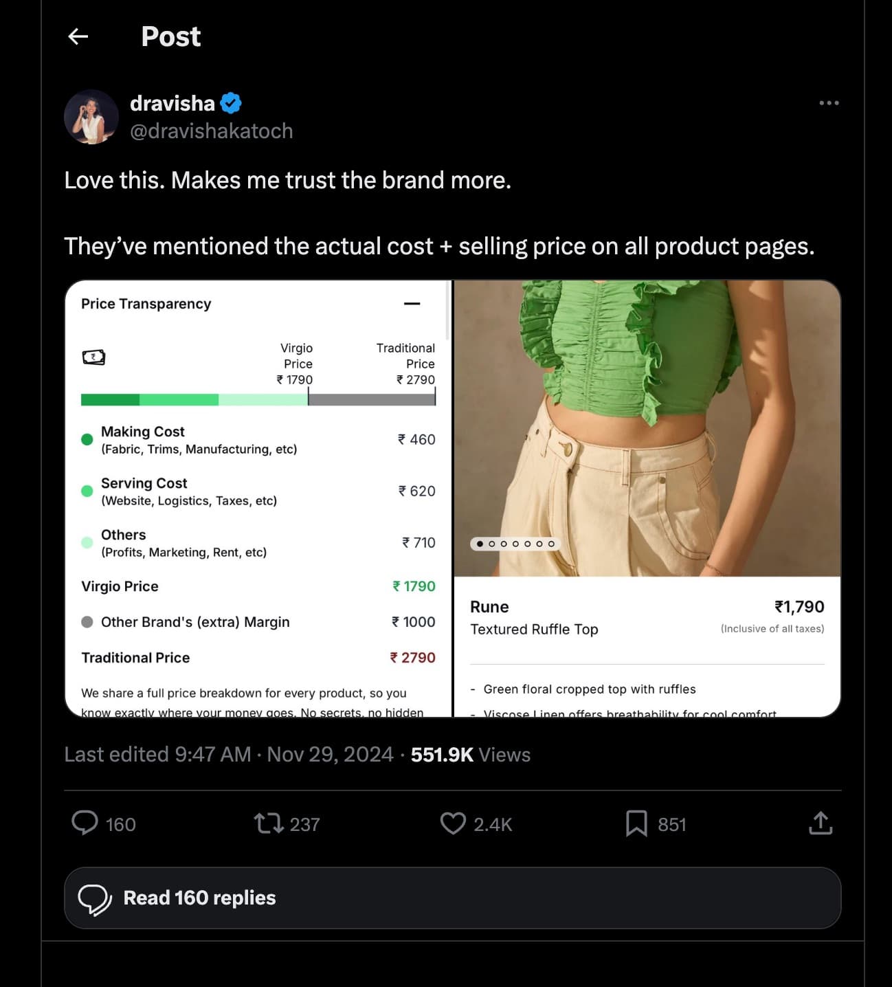
The brief was “make them trust the price”
“Love this. Makes me trust the brand more.”
A verified shopper, not Virgio, posted the widget to 551,900 people, with 2.4K likes and 237 reposts. The feature was designed to earn trust. The proof it worked was a stranger saying so, in public, unprompted. Transparency turned into the brand’s own marketing.

Recognition
Entered as “Transparency: The Future of E-Commerce,” recognised specifically for trust-building. The bill concept then became company IP, the anchor for Econic Fair, Virgio’s cost-to-make sale, which has run two editions.


The problem
The morning standup had just wrapped when my manager walked over: “How do we get customers to trust our prices? What if we show a breakdown on the product page?” Customers don’t distrust prices because they’re high. They distrust them because they feel arbitrary. Give the number visible context and the question shifts from “is this worth it?” to “I can see exactly why.”
Defined problem
Fashion shoppers considering a Virgio product need a way to contextualise the price, because without visible justification, any price feels arbitrary, leading to hesitation, drop-off, and distrust of the brand’s value proposition.
Who
Value-conscious fashion shoppers, primarily women, who weigh quality vs. cost before committing.
What
No visible breakdown of where the price comes from, making Virgio look like every other brand hiding behind margin.
Why it matters
Price anxiety is a leading cause of cart abandonment. Context converts sceptics into believers, and buyers.
“If we showed customers exactly where every rupee went, we wouldn’t need to convince them. The transparency itself would be the argument.”
How might we
The problem turned into four design questions, each one a decision the final widget would have to answer.
HMWmake the price feel earned, not inflated?
Show the cost-of-making, so the final number has a logical foundation.
HMWreduce the cognitive load of the breakdown?
Use a familiar mental model, the bill, so scanning feels effortless.
HMWmake the comparison to traditional brands land emotionally?
Show “Other Brand’s Margin” as a concrete number, not a vague claim.
HMWmake it work across every product in the catalogue?
Build one scalable widget: same structure, variable numbers, never a one-off.
What everyone else was doing
Price transparency wasn’t new, so I studied how every brand attempting it had solved the same problem. They reached for charts, pie graphs, comparison tables, and dense cost ledgers.
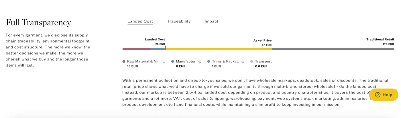
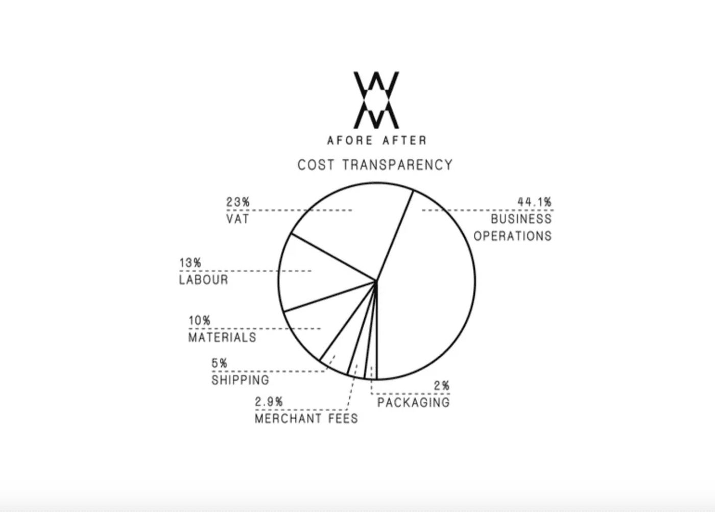
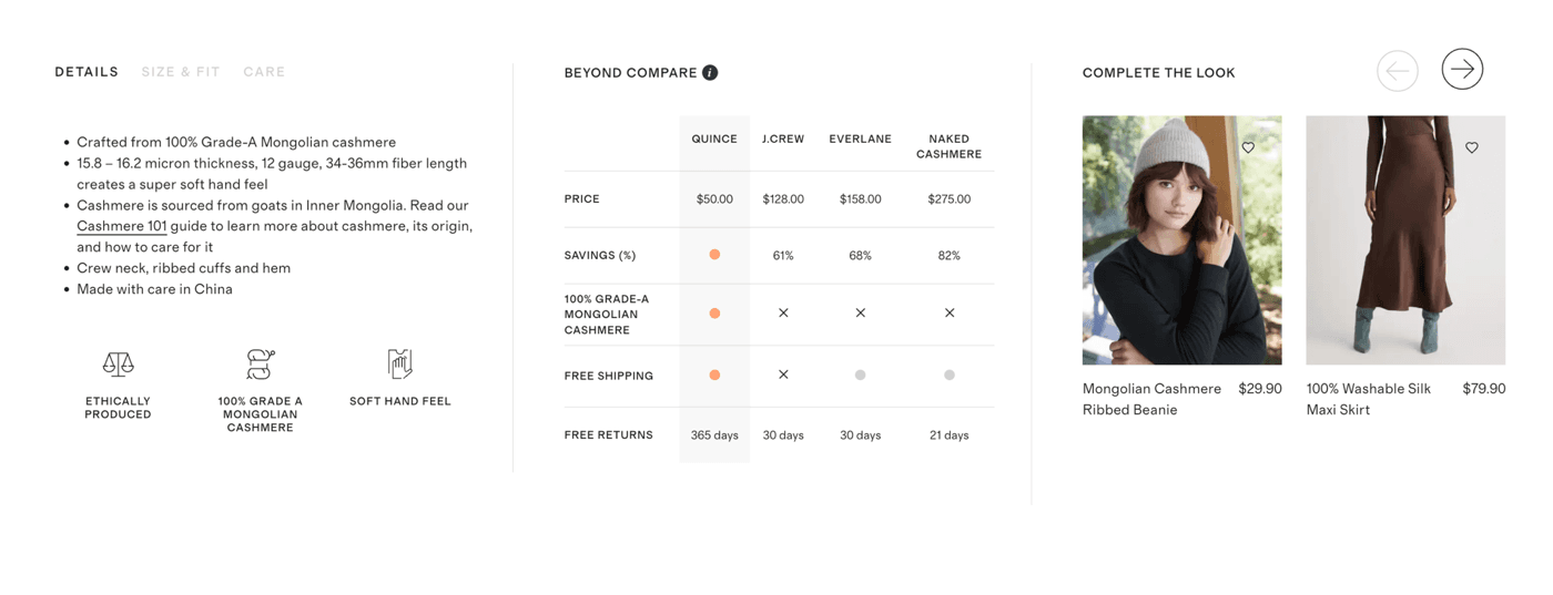
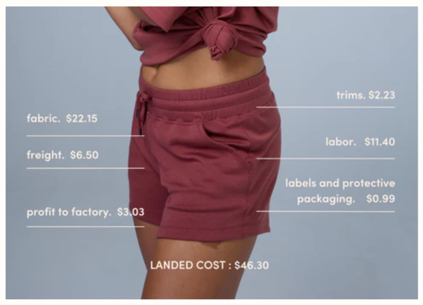
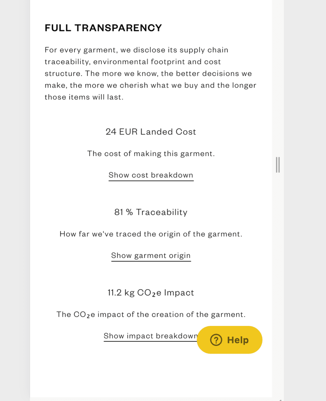
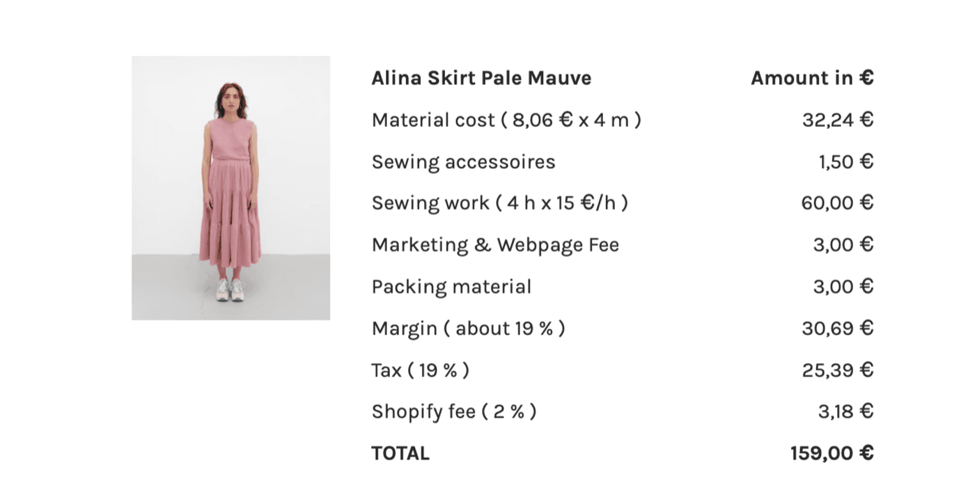
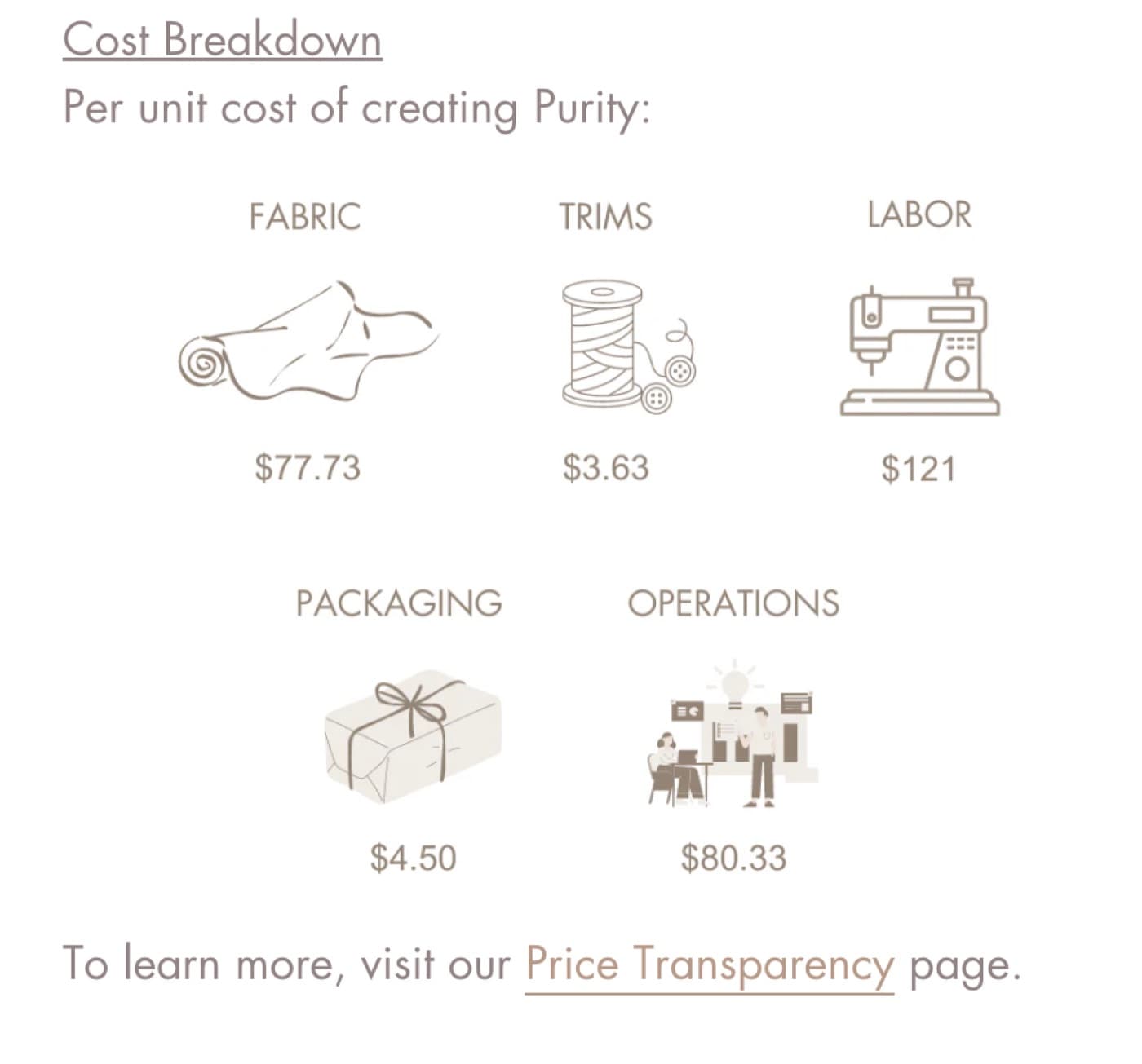
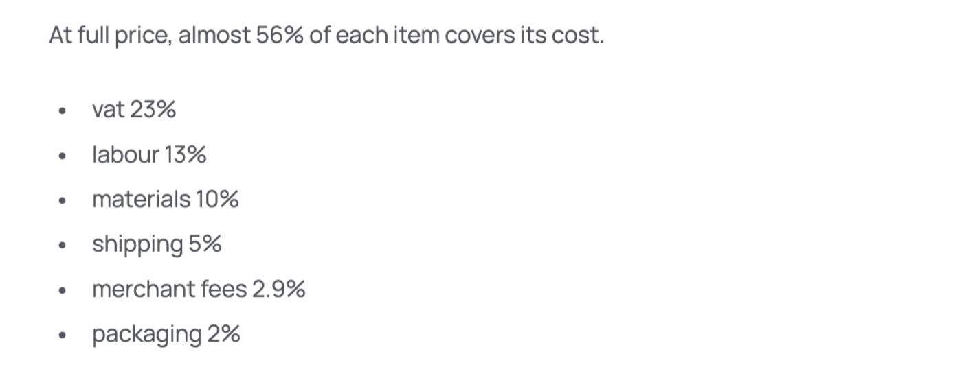
Every one is accurate. Every one asks the shopper to study a chart, a table, or a spec sheet to understand a single number. Accurate, but demanding, and a shopper skimming a product page won’t do the work. The gap wasn’t honesty. It was readability.
The idea: read it like a bill
So I stopped designing a data visualisation and borrowed the one financial document everyone already knows how to read: a bill. A restaurant receipt, a utility statement: items listed, subtotals grouped, the total at the bottom. It adds up naturally because we’ve read thousands of them.
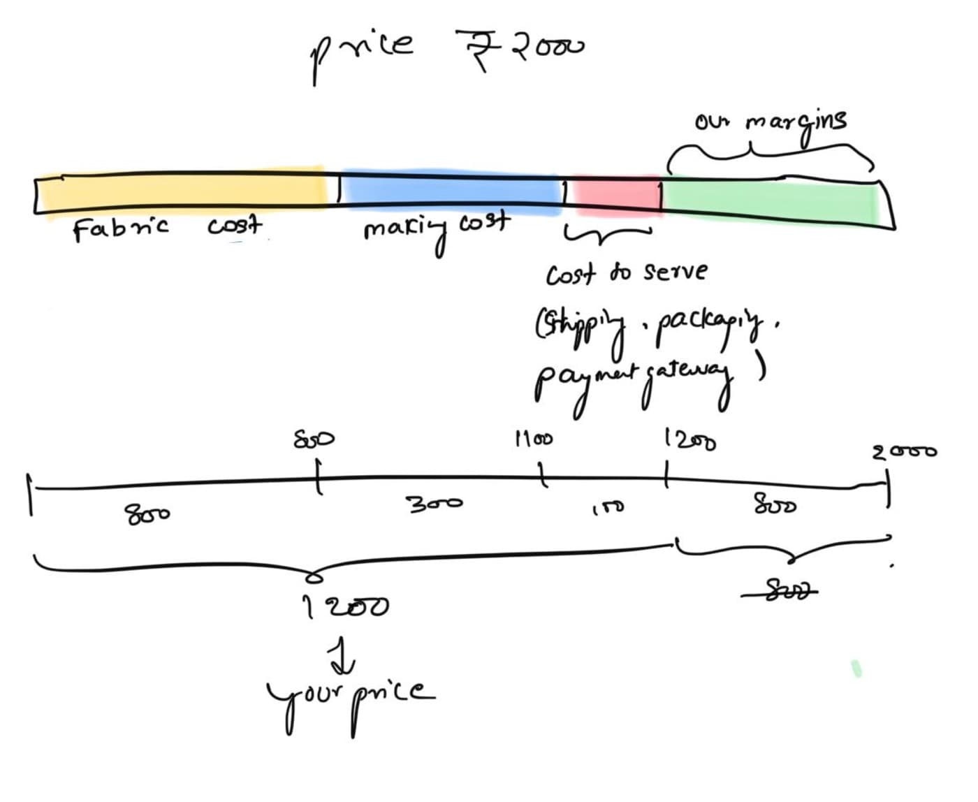
The first sketch worked the math out as a single stacked bar (fabric, making, cost-to-serve, margin) then resolved into line items that total to “your price.” No legend, no analysis. Just a number that explains itself on a skim.
Three iterations
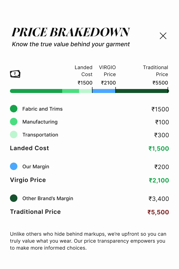
Bold and direct
Modal overlay. Granular line items. Direct margin callout. The bill structure made it scannable without explanation.
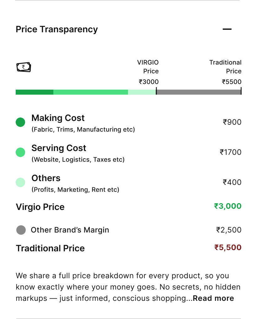
Strategically softer
Inline accordion. Grouped categories with context. Dropped the direct margin callout; user feedback and competitive reasons both pointed here.
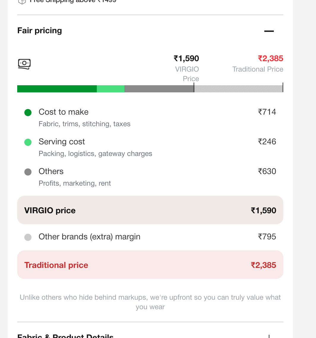
Visual maturity
Highlighted total rows in pill containers. Better hierarchy: totals are impossible to miss on a skim. Aligned to the new brand language.
How we validated it
Method
No formal usability lab. We took the widget to the floor, to women in the office who matched the primary audience. Watched unprompted reading behaviour. Noted what they read first, what made them lean in.
What we found
People didn’t need to be told how to read it. They just did. The bill structure required zero explanation. The only friction came from specific label wording, which we iterated until each line felt instinctive.
The assumption that held
Readability was the missing piece in every competitor execution. A familiar mental model beats a correct but demanding one, every time, in this context.
The assumption that evolved
V1 assumed granular line items built the most trust. Testing showed grouped categories worked equally well: users trusted the total, not the itemisation. That unlocked V2.
“The best solution is rarely the most novel one. It’s the one that borrows most naturally from how people already think. A bill isn’t a breakthrough. Applying it where everyone else reached for a chart is.”