Virgio · Product Design · 2024
Moving checkout off Shopify — and making it quicker on the way out
At peak sale traffic, our checkout leaned on a platform we didn’t fully control — and it showed. I helped move the highest-stakes screen in the funnel in-house, then rebuilt address and payment around one idea: show the consequence of every choice the moment it’s made.
Why we left the platform
The trigger was infrastructure, not pixels. During high-traffic events, checkout fired enough API calls per session to brush up against the platform’s rate limits. Past that line, calls got throttled — responses slowed, the flow wobbled, exactly when the most carts were in play. Underneath it sat a harder truth: we didn’t own the surface where our revenue actually lands.
System
Rate limits at peak load throttled API calls, dragging response times and destabilising checkout at the worst possible moment — the sale event itself.
Experience
Limited control over the UI meant no real brand alignment and slow, expensive iteration on the flows that mattered most.
Observability
No funnel instrumentation. Drop-offs were invisible — we couldn’t see where people left, or why, so we couldn’t fix it.
Business risk
Owning none of the infrastructure on a revenue-critical touchpoint was the real exposure. So checkout became step one of the migration.
“Hesitation at the final step is the most expensive hesitation there is. We weren’t losing people on price — we were losing them to lag.”
Where to aim
Rebuilding from scratch is a licence to redesign everything — and a trap. I started by asking what a shopper actually weighs at checkout: what it costs, when it arrives, and what comes off the top. That narrowed a whole screen down to the two decisions that carry the drop-off — picking an address, and picking a way to pay.
Goal 01
Cut drop-off at the single most critical step in the purchase.
Goal 02
Lower the friction and the thinking required to choose how to pay.
Goal 03
Shorten the path from “this one” to “confirmed” — fewer screens, no detours.
Principle
Make every consequence visible at the moment of choice. No surprises waiting on the next screen.
The redesign
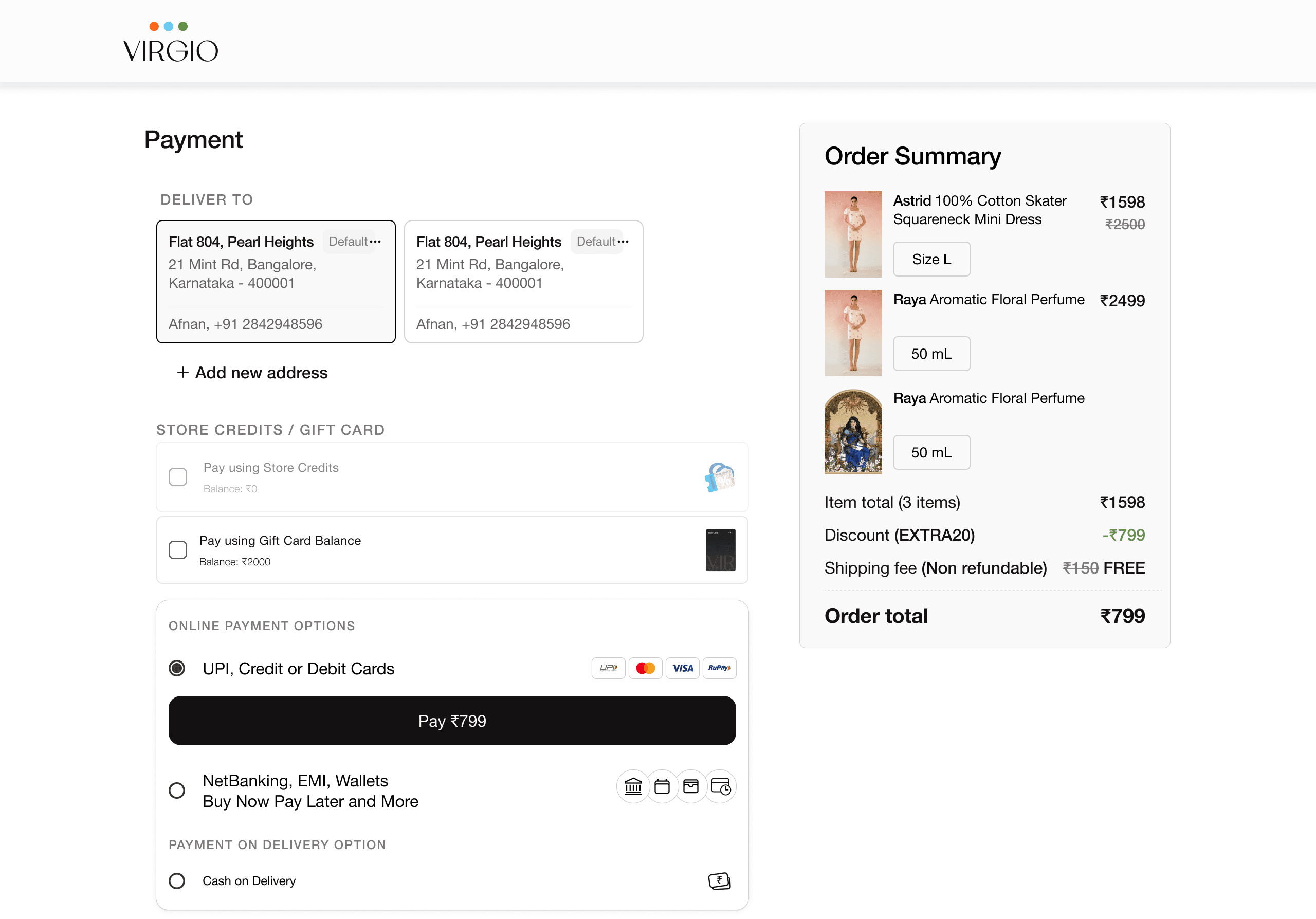
Payment — what you’re paying, and how, in one glance
Three explorations led here. The final structure builds on the address insight without adding a single step: everything resolves in one downward read, so the shopper always sees the amount and the method together before they commit. Store credits and gift cards surface first — adjust the payable amount, then settle the rest with UPI, cards, NetBanking, EMI, wallets, BNPL or cash on delivery. An always-visible order breakdown — item total, discount, the waived shipping fee — means the number on the pay button is never a mystery. Confidence in, friction out.
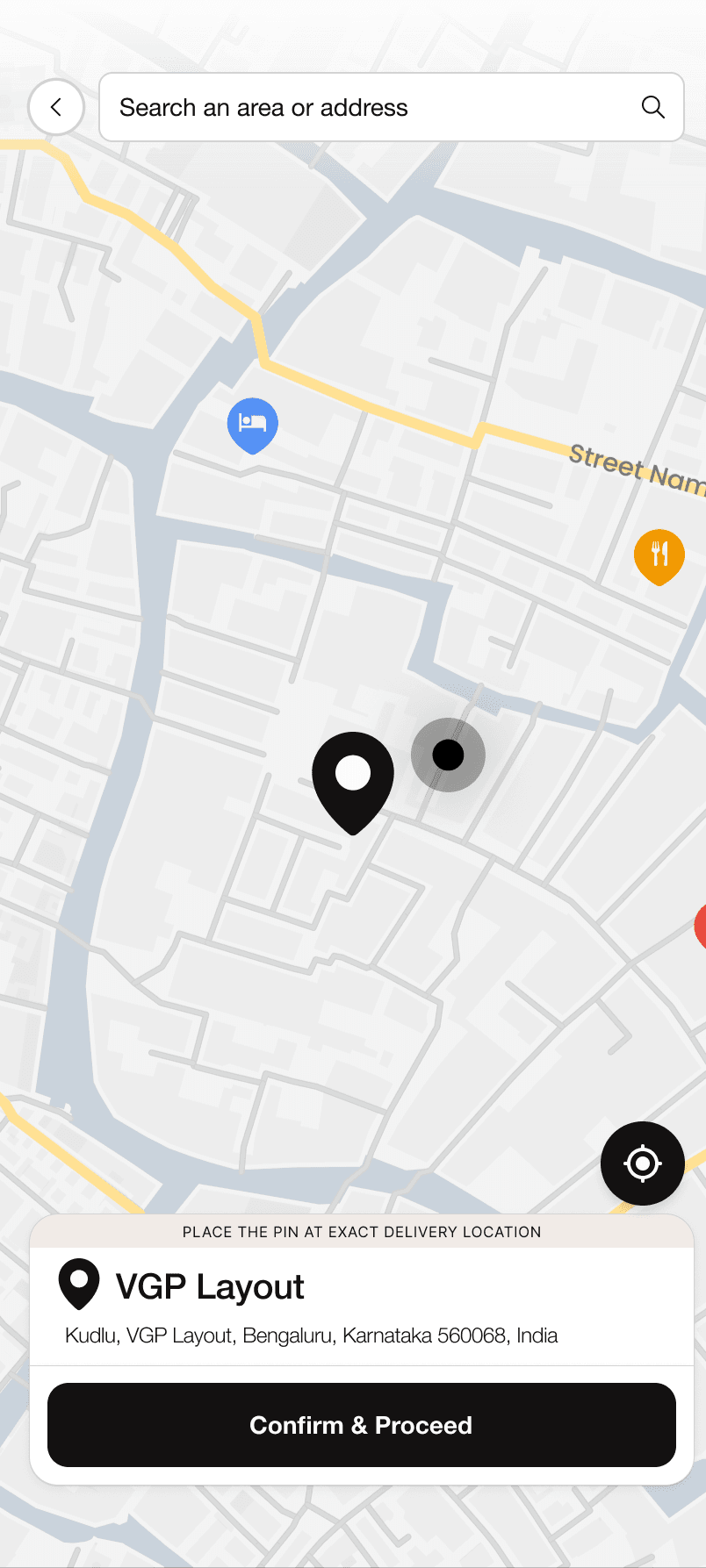
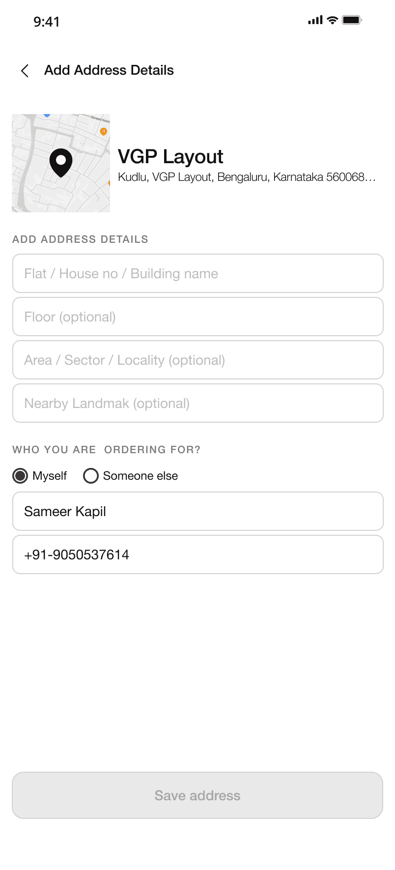
Address — choices with their consequences attached
Saved addresses come back from Shiprocket after login and land as scannable cards; pick one and the delivery estimate updates on the spot, so the trade-off is never hidden behind a tap. No address on file? A quick “who are you ordering for — myself or someone else” prompt sends you into a fresh add-address flow, and the pay button stays off until there’s a valid one. Custom-fit items flag a prepaid-only notice up front, so the constraint never surprises anyone at the pay step. A map with search and a draggable pin auto-fills the form — less typing, more precision — and two guardrails catch the edges: a gentle nudge when the pin and address disagree, and a clear stop when an area can’t be served.
What moved
Conversion, up
Checkout conversion climbed to 76.7% overall — a meaningful lift on a flow where every fraction of a point is real revenue.
Faster, end to end
Average completion dropped to roughly two minutes. Owning the stack let us tune the path instead of working around the platform.
Recovered at the map
Over half of the people who backed out of the map step came back and finished — evidence the map was a moment of hesitation, not a wall.
“The migration bought us control; the design spent it well. Once we could see the funnel and shape the screen, the wins came from removing doubt — not adding features.”